
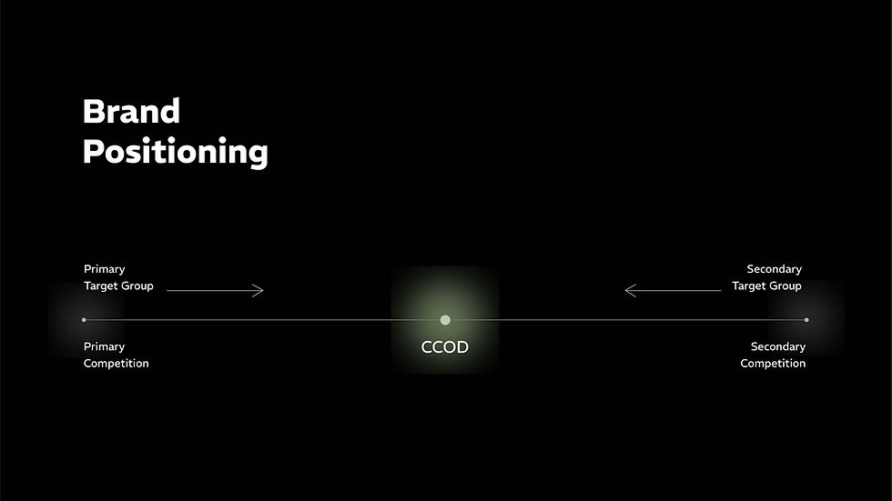
CCOD
Strategy
Identity Design
Photography
Website
Social Media
CCOD (Curious Case of Design) is a design studio practicing architecture, interior, furniture design and many more disciplines. Their core belief, 'good design is a universal problem solver', shapes their practice.
We helped CCOD create a brand identity that accurately reflected their diverse practice that comes from their core belief. We collaborated to create an extensive brand book & visual identity system.
Articulating the Brand
Choosing the right words to represent your brand is the most underrated step in branding. Words are powerful. The right language doesn't just attract people, it attracts the right people.
Accurately articulated brand will clearly communicate its values, ensuring your audience never feels misled or cheated, which ultimately builds trust.
The precision in writing your vision and ethos gives your business a guiding compass, keeping your team aligned and on the right path. And that's where we began our branding process for CCOD.
Problem with the word 'Multidisciplinary' :
It's a common industry word used by many design studios, because it's an easy way to show the breadth of services. However, it fails to convey anything essential. It doesn't explain why you offer these specific services, or, how they benefits the customer.
It’s a descriptive label, not a statement of value.

Tells you offer multiple services
'Multidisciplinary'
'Adaptive'
Tells you offer multiple services
Tells why you offer them
Tells how do they benefit
CCOD's manifesto
We are an ADAPTIVE DESIGN STUDIO.
We do not demand clients to fit into a mold, to adhere to a fix style or use materials or attitude.
We adapt to their Brief | User | Space | Culture | Lifestyle | Geography
"People ignore design, that ignores people"
- FRANK CHIMERO
It all started with this quote
It envelopes CCOD's brand belief and values perfectly. And has become the foundation on which the entire brand is built.
WE DESIGN FOR PEOPLE.
CCOD's unofficial tagline
Function > Form.
This is a popular and an important design principle, but CCOD takes it even further and align it with their core value.
CCOD's approach
Empathy > Function > Form.
Insight -
India is new to luxury. Thinking beyond just needs, we now care about convenience, perception & self expression; and we are capable of investing in it. We just need someone to help achieve it.
CCOD's purpose
Enhance people's lives with full potential of design.


Brand Book


Visual Identity
REM
The REM font family is a sans serif font. It features a heavy low contrast combined with outstrokes that get slightly thinner, which is the opposite of the conventional approach.
The name REM is an acronym for "Rapid Eye Movement," which refers to a stage of sleep characterized by quick, random eye movements.


Building Communication
Having built the foundation earlier, developing communications was straightforward.
Every piece is built to reflect CCOD's fundamental belief, 'we design for people.' All comms pieces prioritize human experience. Staying true to CCOD's approach to design, 'Empathy > Function > Form.'
Website Design


Photography


Social Media


Hear it from the client

We're glad we did this exercise with Bigenough, it has made our decision making process faster and clearer.
All the communication touch points are now reflection of our values, which has made the overall brand experience better for our clients.
- Nandan & Ankita
Small enough to care, Bigenough to deliver