Simply Body Talk
Simply Body Talk was founded in 2013 with a clear purpose: to bridge the critical gap between professional ambition and the nonverbal skills needed to achieve it. We saw countless talented individuals held back, not by lack of skill or knowledge, but by an inability to effectively communicate their competence and build trust through body language

The brand intends to help improve body language for greater impact when communicating. They can achieve this by being the leading authority for the practical application of body language science.
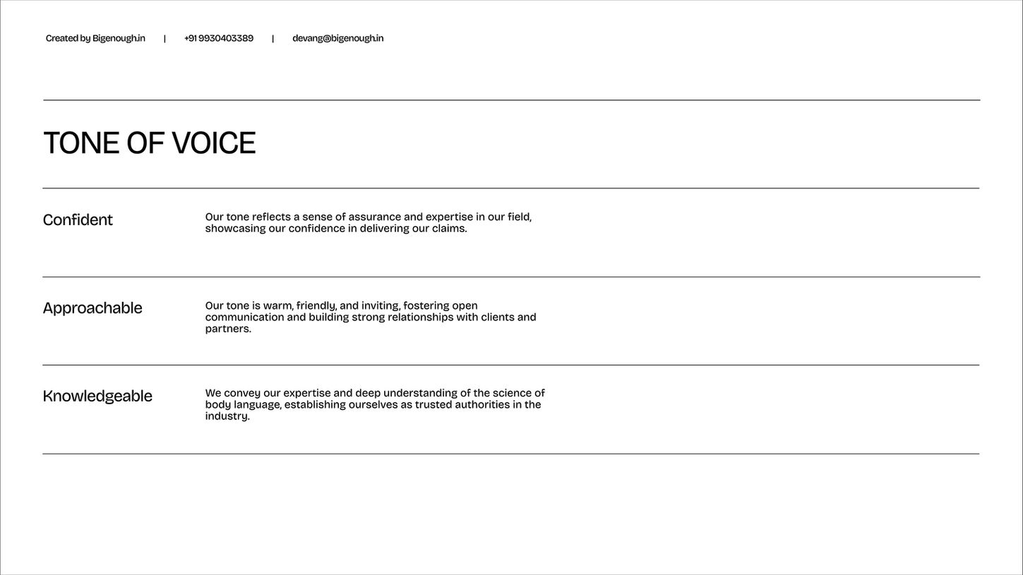
Basis this understanding, we narrowed down the brand's tone of voice to these three :
-
Confident : The brand's tone reflects a sense of assurance and showcases expertise in the field.
-
Approachable : A warm and friendly tone inviting open communication & building strong relationships.
-
Knowledgeable : Convey Expertise and deep understanding of the science of body language.
-
We started with a question : 'What is the true meaning of communication?"
The answer that we arrived at was an eye opener. Most of us think that conversation is just what we say. But conversation is also about what the listener understands.
We arrived at theHighlighting Body Language: Representing the efficiency of body language (little said/black dot, much understood/white area) versus the potential inefficiency of purely verbal communication (much said/black area, little understood/white dot) directly supports Simply Body Talk's value proposition. It visually argues why mastering body language is crucial.
Direct Relevance: Incorporating the faces makes the link to human interaction and body language explicit and immediate
We arrived at a logomark that truly embodies the essence of the brand and what it stands for. When choosing the typeface, the aim was to find a balance between serious & fun.
Setting the distance between the logomark & the logotype was tricky as the logo mark had to be versatile enough to be flipped on either side. Getting the correct spacing was crucial.
Subtle Reinforcement: The transformation into quotation marks at smaller sizes is a clever touch, reinforcing the theme of communication and language in a subtle, layered way.
Strong Visual Identity: The black and white contrast is striking, and the design is clean and modern.
Versatility: The logo retains it's ability to work effectively when rotated, flipped, or placed on different backgrounds without modification is a significant practical advantage for branding applications.
The brand intends to help improve body language for greater impact when communicating. They can achieve this by being the leading authority for the practical application of body language science.
Basis this understanding, we narrowed down the brand's tone of voice to these three :
-
Confident : The brand's tone reflects a sense of assurance and showcases expertise in the field.
-
Approachable : A warm and friendly tone inviting open communication & building strong relationships.
-
Knowledgeable : Convey Expertise and deep understanding of the science of body language.
-
Small enough to care, Bigenough to deliver


