Hear it from the client

We're absolutely in love with how our packaging turned out! Having the references of Kathiyawadi culture in our branding was really important to us.
The strategic part has now become the foundation for every decision we make. it's given us a solid value structure that’s invaluable.
Arjun Dave.


Brand Seal
We wanted a logo for Tikumaa's that felt humble and rooted in tradition, yet was dynamic enough for the digital world.
We created few adaptable versions of the logo. This approach gives us the practical flexibility to choose the right one for any context.

Tikumaa's
Strategy
Identity Design
Packaging
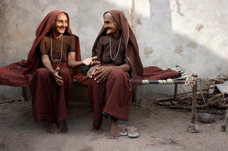
Tikumaa's is a Kathiyawadi food brand offering high-quality condiments and snacks. It originated when Tiku Ben, a homemaker, mother, and wife, started making pickles for friends and family by combining her mother's and mother-in-law's traditional Kathiyawadi recipes.
Now, Tikumaa's is aiming to sell their products online, both in India and internationally.
Our goal with this project was to create a brand identity that is rooted in Tikumaa's values and Kathiyawadi heritage while also appealing to both its local and international audience.
Thought Process
We started with asking simple questions that lead us to an interesting insight into Indian food consumption.
Have you ever had...
Avocado toast with chaat masala?
Chaakli dipped in schezwan sauce?
Achaari pizza? or Khausaa?
If yes, then you’re a true Indian.
We Indians possess the unique skill of being global and local at the same time.
Observation
Food trends change, but taste remains.
Modern life leaves little time for traditional cooking, but we crave those familiar tastes.
Market Gap & Potential Solution

Brand Concept
Everthing, Kathiyawadi.
We celebrate new ideas, cultures and dishes, but without giving up on being true “Kathiyawadi”.
How we do it?
We make pickles & papad, but Kathiyawadi.
We also make spreads & dips, but Kathiyawadi.
Brand Values
Brand Voice
Innovating for modern life
Create this
Authentic Kathiawad flavours
While achieving this
Premium quality & handcrafted
By doing this


Packaging Design Research
Our goal with this reaearch is to find authentic Kathiwadi art references, and use them as our inspiration to develop Tikumaa’s visual identity.

Brand colours

Brand vectors

Brand typography
NOTO sans
Regular, bold
Headings & Subheadings: Bold weight.
Body Copy & Paragraphs: Regular weight.
Agency
Bold
Highlighting/Differentiation.
Use sparingly (maximum 4-5 words).
Packaging Anatomy

